Typography- ‘A word can paint a thousand Pictures’
Tips for Creating Merch Designs That WORK, By Dean Cohen

It is said that a picture paints a thousand words. The truth is that the ‘word’ can paint a thousand pictures. Typography is the art of type arrangement to create a visual aesthetic. Typography like graphics; it’s counterpart, employs the careful consideration and interplay of shape; form, placement and proximity. What makes a strong typographic design is often a combination of design considerations.
There is an absolute truth in saying ‘just because it’s there doesn’t mean you have to use it’. There are as many fonts out there as there are books…ok not quite but you get the idea! Just like not every person is made for each other; not every font is made to be used together. Often one of the biggest mistakes, when designing, using type as the key design element; is the need to throw in multiple, unrelated typefaces and expect that they will magically complement each other. In most cases the old adage of ‘less is more’ is true when designing with type.

The following are some fundamental principles to consider and employ for better typographical design on your tee’s:
• How well does your text read? It is all fine and well wanting to introduce different; interesting and unusual font-types into one design but if the text is illegible then this defeats the purpose. Consider using text that is clear (whether it be serif or sans-serif) and utilize the basic principles of kerning ( space between letters); leading( space between lines of text) and weight (this is the attribute of font ‘thickness’) and proximity to enhance the legibility and impact of the design.
• Fewer fonts – Consider using a smaller variety of fonts in your design. It makes for a more cohesive and coherent design
• Capitals vs Lowercase – There is an argument for ‘mixing things up’ but generally speaking try and stick to a degree of uniformity when using either Capitals or Lower case letters. Another important thing to take heed of is that some font-families; specifically Serif- fonts, are only designed in Capital Letters and although it may look good when presented as an alphabet; their legibility when used together in a design, can be difficult to read. There has been a big move in recent years toward the use of San-serif fonts ( Proxima Nova, Open Sans, Futura, Gotham)
• Font Distortion- Sometimes ‘Designers at Play’ to coin a phrase; will use various techniques to distort or manipulate fonts, to create a new and interesting design. The rule here should be that there is a place for this but not at the expense of legibility. Some fonts were not necessarily designed for this.
• Impact – Often when the message is all important, simple wins over intricate. Consider using strong San Serif Fonts like; Proxima Nova, Frutiger, Helvetica and DIN. These are but a few that one could consider. The Web is a great design resource has a wealth of free-to-download Font-Face/Font-Type sites.
When applying these design principles to your T-shirt Designs there are a few other considerations that will make a difference between a design that works and one that doesn’t:
• The Background colour of the T-shirt will have a direct bearing on the legibility and the impact of the design. Ensure that the design compliments the color of the Tee and does not distract or clash with it. For a range of or great color combination ideas check out :
http://www.printmag.com/article/50-best-color-sites-graphic-designers/
• When designing for the T-shirt format your design area is predetermined by supplied dimensions or the ‘printable’ area. It is important to ensure that the Typographic design fit well, within this designated area. Design with surrounding or ‘negative space’ (Negative space, in art, is the space around and between the subject(s) of an image) in mind is all important. The Negative space on the shirt often becomes an indirect design element that influences the focus and legibility of the Typographic design.
• Again Simplicity when working in a ‘restricted’ area is key. You are designing to make an impact at first glance…maybe second. The marriage of message and font (how it is used; either as is or manipulated) are important and often determine the impact of the message or the lack thereof. As a rule; rather err on the side of a clean, strong and simple font or two.
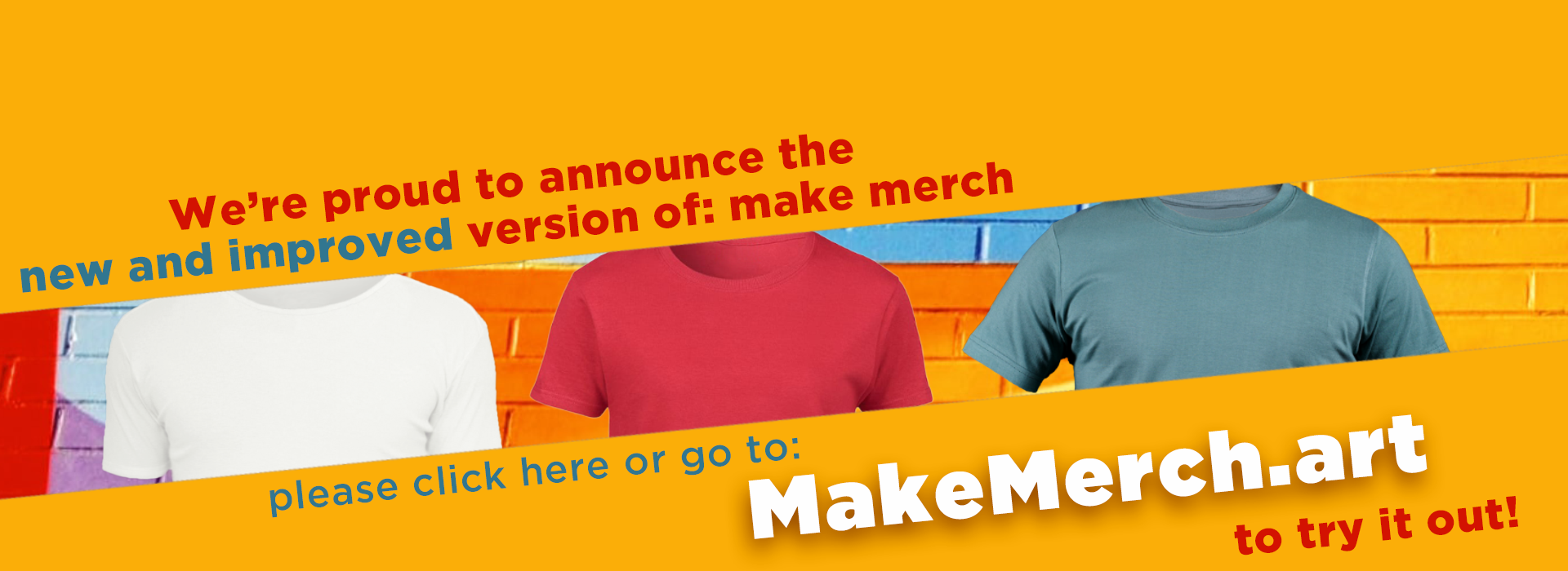
Make-Merch.com recently released an excellent ‘Text with Image Overlay’ design template and I believe an even more advanced one is on the way.
To create text tees with typography that stands out from the crowd, use this design tool at https://make-merch.com/text-with-image-overlay/ ; applying an overlay image from the available options. Match the font, the text and the image carefully so as to create the unique design you’re after. A combination of one or more words, an interesting font and a strong image (as part of the text) result in a powerful visual and a t-shirt that sells!

As a parting shot so much of design is about observation; having or developing a critical eye and the patience to iterate and re-iterate. Taking time and pride in your design will ultimately payoff!
About the Author:
Dean Cohen is a Graphic & Web Designer with over 25yrs of experience. Apart from running his own successful Design Studio called GIVEITAFACE ; specialising in Brand, Graphic and Web Design Solutions, he is also an active contributor and seller of his designs on the Redbubble Platform.